Month: June 2015
Oscar Niemeyer, Entre Organique et Formaliste

Généralement, Une architecture est dite organique quand elle fait intégrer le bâtiment dans la nature d’une part et dans son site d’autre part, et transforme le bâtiment en un organisme vivant qui complète le site.
De nos jours, La définition d’une architecture organique est mise en question; Cette architecture se manifeste-elle par une intégration dans le site ou bien par une imitation de la nature et des formes biologiques?
Prenant Oscar Niemeyer comme exemple. Cet architecte contemporain peut-il être considérer comme architecte organique ?
Selon l’école de Frank Lloyd Right, précurseur de l’architecture organique, une architecture organique doit s’intégrer dans la nature et former avec le site, un seul organisme, vivant, inséparable.
Un parangon de l’architecture organique est la maison de la cascade de Frank Lloyd Wright a Pennsylvanie. Wright a choisit de placer cette maison directement au-dessus d’une cascade, créant ainsi un dialogue sonore avec l’eau et le site escarpé. Les porte-à-faux impressionnants en béton donnent la sensation de la peur d’un équilibre instable. Cette maison devient ainsi une belle vue donc une partie vivante de la nature.
L’architecte américain définissait l’architecture organique de la manière suivante :
« L’architecture organique devrait être l’idéal moderne, et son enseignement tellement nécessaire si nous voulons voir la vie en entier, et à partir de maintenant servir la vie dans son intégralité, ne tenant aucune tradition essentielle à la grande TRADITION. Il ne faut chérir ni forme préconçue nous liant par-dessus nous aussi bien au passé, au présent qu’au futur, mais plutôt exaltant les lois simples du bon sens, ou d’un sens supérieur si vous préférez, déterminant la forme par le biais de la nature et des matériaux» Frank Lloyd Wright.
D’autre Part, Oscar Niemeyer, architecte brésilien, a fait une révolution et une guerre architectonique contre la ligne droite, les angles aigues et les formes cartésiennes arguant que la nature et les forme biologiques ne sont ni droites ni cartésiennes. Pour cela il choisi les formes en courbe, fluide et non linéaire et définit cela comme architecture organique.
Contrairement aux romantismes du mouvement de l’architecture organique, Niemeyer voit la technologie comme un progrès. La construction en béton a rendu possible les courbes avec lesquelles il complétait le design moderne et protestait contre les angles du rationalisme.
«Ce n’est pas l’angle droit qui m’attire , ni la ligne droite, dure et inflexible , créée par l’homme… Ce qui m’attire est la courbe libre et sensuelle, la courbe que je trouve dans les montagnes de mon pays, dans le cours sinueux de ses rivières, dans le corps de la femme aimée», a déclaré Niemeyer.
Niemeyer a donc résisté aux angles aigus impitoyables du modernisme.
« Un être humain ne marche pas dans les lignes droites.. J’ai eu un malaise spéciale avec des boîtes carrées », a déclaré l’architecte Joseph Pettick .
De sa part, Le théoricien David Pearson proposa la charte de Gaïa, un ensemble de règles pour dessiner une architecture organique. Selon Pearson une architecture organique doit être inspirer par la nature et être durable, bonne pour la santé, protectrice et diverse. Elle doit déplier comme un organisme se déplierait depuis l’intérieur d’une graine. Elle doit se développer à partir du site et être unique.
Alors on peut conclure que les formes naturelles et biologiques qui sont seulement une imitation des formes et une inspiration de la nature sont considéré pas plus que des formes organiques. Ainsi, l’architecture d’ Oscar Niemeyer est une imitation de la nature en forme organique. MAIS n’est pas une architecture organique vue qu’elle ne répond pas aux conditions requises d’une architecture organique de Wright et de Pearson.
By Rami Najem

Who Owns The Lebanese Coast?

Since the end of the Lebanese Civil War, the Lebanese Coast has been subject to privatization, and countless encroachments on public land. The Lebanese Coast that stretches to approximately 220 kilometers should be a source of wealth for Lebanon and a common space for its citizens, as well as provide a competitive advantage on the regional level. Instead, the coast is subject to constant violations along the beachfront.
In 2012, a report sent from the Ministry of Public Works and Transportation to the Prime Minister’s office exposes astonishing facts about organized and protected operations to seize public beachfront property in Lebanon.
The report names former presidents, ministers and parliamentarians, as well as political parties, party officials, local chieftains, and their lackeys who carry the titles of ‘investor’ or ‘entrepreneur.’ So basically, everyone who is in charge of this country.
The report estimates the total occupied beach and sea area to be over 2,535,788 square meters, in addition to around 1,356,938 million square meters of ‘licensed’ occupations.
The so-called ‘licenses’ are based on cabinet decisions which violate the constitution and basic laws. They give particular people and organizations the right to exploit public property at the expense of the rest of society.
Despite the outrageous details provided by the ministry that has been entrusted with managing maritime property, little works have been done to ensure the integrity of the shoreline, and violations are yet to be stopped.
Now, there are no laws that prevents an individual, company or organization from owning property on the coast. And according to the Lebanese Construction Law, a 10 meters retreat of the construction is to be taken into consideration when building on a river border, since rivers are considered as public entities, but there are no laws that restrict a construction on the coast.
So why is the mandatory retreat from the coast line, that is public property, excluded from the Lebanese Construction Law?
According to the report previously mentioned, The total area occupied by illegitimate beachfront encroachments is therefore just under 5 million square meters, with a current market value of tens of billions of US dollars. In the meantime, the occupiers make hundreds of millions of US dollars a year in profit.
I will just go on a hunch and say that the people who are illegitimately building on the beachfront are politically endorsed and are making too much money with the politicians who are endorsing them, and therefore no laws are being issued to stop the illegal constructions and privatizations of the coastal area that is supposed to be a public resource for all. But that’s just me, I could be wrong.

In the picture above you can notice that the private constructions in California have retreated from the coastline, respecting the public entity that is the beach, and that is just a small part of the Californian coast.
I am not comparing the Lebanese coast with a foreign coast, don’t get me wrong, but there should be some sort of regulations towards public spaces in Lebanon, especially the Beach. Such a waste!
In recent development, a campaign against the privatization of Raouche and the adjacent area called al-Dalieh that was initially entitled “The Last That Remains” started in early 2014, and is still active today under the name “The Civil Campaign for the Protection of Daliet – el – Raouche“.

This campaign came as reaction to a rumored (but apparently true) story, that a multi-million dollar real estate construction project by Architect “Rem Koolhaas” head of the Office for Metropolitan Architecture (OMA) is to be built in the “Dalieh” region.
What is The “Dalieh”? – “Dalieh” is located in the “Raouche” region, facing the famous “Pigeon Rock”. It is basically the last public beach area in Beirut.
Before the area was fenced up this year, “Dalieh” was frequently visited by the public for various activities like swimming, fishing, or simply just gathering. I’ll leave all the poetic flattery for the activists to say, but I’ll say this, “Dalieh” deserves all the attention it can get, I’m glad that someone finally stood up to say enough to all the violations that are happening on the coast.
Activists have also sent out an open letter to Mr. Rem Koolhaas, you can read it here in The Jadaliyya Website, and The Beirut Report has provided some details concerning the project’s legitimacy.
Now let’s face it, this is not the first time this has happened here in Lebanon, and it probably won’t be the last, referring here to the “Zeitouna Bay” Beirut Marina project that took away a very important part of the public sector and privatized it, to be now only visited by the higher class society. And if memory serves correctly, Steven Holl, the world-class architect, had a big part to play in it.

By Assaad Hakim
source: The Blogtato

USEK’s 40+ Student Expression

As part of the 40th anniversary of Faculty of Fine and Applied Arts, the Holy Spirit University of Kaslik (USEK) is organizing an exhibition entitled “40+ Student Expression”.
This event, hosted by the Faculty of Fine and Applied Arts, will take place on Thursday June 25, 2015, between 5:00 pm and 8:00 pm, in the floor B3 of Building H.
The exhibition will continue until Friday June 26, 2015, from 9:00 am to 8:00 pm.

Sources:
USEK Events
USEK Official Website
USEK Arch Club (U.A.C)
Imaginative Movie Directors Houses Illustrations
Illustrator Federico Babina, seen previously, imagined, in a collection named “Archidirector”, the architecture of iconic movies directors houses. Homes are faithful to the particular movies univers of Alfred Hitchcock, Charlie Chaplin, Wes Anderson, George Lucas or Stanley Kubrick.


Source: Fubiz.net
USEK Best Architecture Student Will Work At Renzo Piano’s Office

Every year The Holy Spirit University Of Kaslik (USEK) give a 6 months job opportunity at Renzo Piano Building Workshop for the architecture student who win the first place and get the highest grade on final year senior project.
This year (spring 2015) the prize went to architect Vanessa Houeiss who got 95/100 on her project.
Congratulations to our fellow architect and good luck in the new job.

Source: USEK Arch Club (U.A.C)


Lebanese Students Meet Alvaro Siza

A group of Lebanese Architecture students from USEK University went to France to attend a workshop at domaine de Boisbuchet with Architect Álvaro Siza Vieira !
Source: USEK Arch Club
Today’s Architecture… A Step into the Future

GREAT! Now that I have your attention I am going to bring up a topic that many have yet to talk about. Maybe the cause is ignorance, or perhaps the human race is just afraid of acknowledging the scientific facts in front of them, personally I believe it’s a mixture of both.
OVERPOPULATION
How are we reacting to the changes of this world? How is our ARCHITECTURE reacting to this overpopulation? What will happen when we exhaust our natural resources and building space? Claim the moon as building space? Maybe.
Lets review the facts –
The world population has experienced continuous growth since the end of the great famine and the black death in 1350 when it stood at 370 million. Since the industrial revolution in 1760, the population grew exponentially reaching 1 billion in 1804, growing even further to reach 6 billion in 1999, and 7 billion in 2011.
So basically humanity took since the existence of the Homosapien until 1804, to reach 1 billion, and then in 200 years managed to get multiplied by 6, and then to add another billion to its numbers in 12 years.
According to the UN, if this exponential growth continues, humanity will reach 16 billion by the year 2100
Can you imagine a 9 billion increase in population in less than a century? Off course you can! You’re Smart!
Now to the point –
Architecture has relatively well reacted to this increase of population, living in multi-storey buildings in individual flats is proof of that. The substantial number of skyscrapers already built is also a reaction to that overpopulation.
Building space is much harder to come by these days, so humanity has taken it upon itself to solve this problem.
How you ask?
Well, by burning down forests for a start. Building cities in vast deserts, and even creating artificial islands and then selling them for high-priced building space.
ALL AWESOME IDEAS – Don’t you think?
The fact is, humanity has managed to destroy most of its natural resources in a very short amount of time!
“God always forgives, Humans Sometimes, Nature Never” – Pope Francis
Food For Thought.
By Assaad Hakim
source: The Blogtato
10 Typical Perspective Errors
Drawing perspective is considered one of the hardest things in art, except the mistakes usually done are pretty much always the same and can be avoided with a little care.
1. Lines not reaching the vanishing point

Well this is pretty simple to avoid but it’s the most common mistake. It’s probably due to either carelessness or really not having understood the basic of perspective. I encourage you to go back and find some basic tutorial for this.
Anyway, be ALWAYS careful about where to ‘send’ your lines, they NEED to go towards the correct vanishing point or it will just look awkward. Double check if necessary.
And always, ALWAYS use a ruler.
If your style requires lines that are a bit less geometrical (as mine do, I have a style of inking that’s sketchy so ‘perfect’ lines drawn with a ruler usually don’t fit well in the picture) use a ruler anyway for the pencils and then ink later by freehand. At least you’ll have correct guidelines underneath.

For traditional drawing be sure you have a ruler and be sure to use it for each one of your lines.
Modern drawing software will help you a lot with this if you draw directly on computer: painting software such as Clip Studio Paint or Manga Studio 4EX or 5 have perspective tools that will automatically snap your lines towards the vanishing point.

it’s quite a long tutorial, you’ll find the rest under the Read More or you can download the pdf file here
1a. Planes not reaching the vanishing points.
Same thing as before, but very often people send more than one line to the wrong vanishing point.

Try to have your lines being consistent and reaching the right vanishing point. If one side of the plane has a different vanishing point from the opposite side the resulting plane will look awkward.
There are of course cases where you need to use different vanishing points purposefully, but of course you have to be consistent with the rest of the shape you’re drawing. I do not want to add to the confusion so I won’t talk about those instances, so my advice is: avoid doing this until you are confident enough to advance your studies of perspective more.
More often than not those mistaken planes reach a vanishing point that’s outside the horizon line. Let’s remember that vanishing points NEED to be on the horizon line.

Here’s the correct one

2. Depths
This is an error that EVERYONE will do at the beginning and it’s the first telling that someone is a novice. Actually it’s the most common error I’ve ever seen. It’s also an error you see in half the perspective tutorials you’ll find online.
Objects have depths. These depths needs to be not as long as you imagine it.
This is a cube:

Actually it’s not.
This one is:

It looks much more like an actual cube.
At the beginning you’ll tend to make depths MUCH MUCH longer than they should be. And this is something you can correct only with exercise and double checking everything.

That shutter is gigantic.
Furthermore, the closest you get to Horizon Line the ‘thinner’ the depth of the object should be.
Not like this:

If you walk in front of that building over there you’ll have a Km long building. That won’t do.
Actually like this:

Be always careful with skylines, you’ll tend to draw monsters longer than 10 Km. If it’s a central perspective you can easily draw the skyline with no depth at all like this

With a 2 point perspective the skyline will need a tiny bit of depth but be careful not to overdo.
The only thing you can do is exercise and exercise and exercise and you’ll get the hang of it.
3. Repeating Depths
Repeating distances are often mistaken by beginners. Because it’s one of the things you think you should do by guessing, the point is that no, it should be done with rulers, otherwise it’ll look weird.

You have to use rulers. These are the steps:
Draw the first unit by guessing the depth

Draw three lines in perspective like this: base, height and exact half
Draw a diagonal

Find the new unit thanks to that diagonal

Keep drawing diagonals

Now use this as a base to draw the rest

4. Planes tangent to Horizon Line
This is not an error per se, but it’s just ugly to see. Unless you’re doing a geometrical architecture drawing where the exact measurements are important (in that case I’m afraid this is not the tutorial for you) you can change things to help the general image.
Why do this if you can just move the table a bit and or making it a bit taller to make it look better?


When the planes meet in an awkward way either with the Horizon Line or with each other it look false, it look constructed and honestly it doesn’t help composition one bit.

The drawing is yours, you decide what to do with it, you are not forced to put that table there, if you need to then change it.
5. Lines with no width variations
Another thing that help a lot in giving a sense of depth is variating the width of the inking (or pencil) lines. Closer objects with wider lines and objects far away with thinner lines. It’s simple.


The first one catches your eyes to the far point where all those lines go and make a mess, the second one gives you a sensation of depth.. The ink help perspective a lot.
6. Patterns and details going on towards the infinite
This point reconnects to #2, things get smaller when you approach the L.O, why would you keep drawing those tiles forever?

They tend to distract the eye and it just becomes a big horrible black area while probably your focus for the image was elsewhere. This is something I see a lot with bricks on the walls. At a certain point drawing every single detail hurt the drawing, so you should stop.
The best thing to do is to artfully lower the details level. This is difficult most of the time because you need to tune the amount of details with the image and it’s something that will come easy with time and exercise.

Also details on repetitive objects need to have a lower definition while approaching the Horizon Line, you can’t keep drawing ever single decorated nook of those windows:

It is better to simplify. For example you don’t have to repeat all the details in the bricks for all the windows. Just removing that alone you image is much less of a mess.

Using thinner lines (see previous point) of course help a lot.
7. Objects with no depth and finishings
Another error that look really bad in illustrations and comic pages is when things have no depth and finishings.

Ok that one looks like it’s a sticker on a wall.
I can understand rush and I understand that perspective is long and boring but you can’t do things half-way, it will look weird. Windows and objects are not cardboard cutouts they have depths!
The way to correct this is using references. Go find a real life one, or a photo, or google it.

Have fun with the details, give life to your drawings!
I can understand that different people have different styles but more cartoonish kind of drawings still need a base in reality, and a realistic preparation cannot do anything but help the artist.
8. Central perspective exaggerated
Well, just don’t do it.
If you need to draw a widespread panel just use 2 points perspective.
Central perspective has limitations, and those limitations are: if you bring objects too far the measurements gets weird.

The light blue one is a cube, the other is…. Not.
9. Misplaced Vanishing points and exaggerated perspective
While there are some masters that can exasperate perspective to create really dashing images those are people who have a deep understanding of every rule of perspective and know when to break them. If you’re reading this tutorial chances are that you are not one of those (as I’m neither, I’m good but I cannot do weird things and still make them look good as other people can) so you definitely should avoid doing this.
Placing vanishing points too close or inside the panel/illustration will result in awkward things.

Well, no.

Avoid placing vanishing points INSIDE the panel, really. I don’t even know what’s happening in that door….
And anyway you’re not required of drawing everything, if you notice that keeping drawing towards the borders makes the perspective look weird you’re allowed to crop the drawing there and end the panel or the illustration. You don’t need to keep going on to the infinite, ok?


You are allowed to crop.
I’ve treated how to place vanishing points in another tutorial you can find here.
10. Characters not in perspective

Well, characters need to fit an environment as well. You can’t have tiny people next to a gigantic door.

Be always careful about proportions.
As well as that you need to be careful with relationships between characters as well, characters far away need to be put in relation with characters in front.


Be careful about this. And if you need, help yourself with perspective lines so you can understand the size of your characters. But this is another thing that will come easy only with exercise and making mistakes again and again and again.
This last point has been expanded here.
That’s pretty much it. Actually the most common are without a doubt the first two points, work towards correcting those two and you are already halfway there.
By Martina
Source: electricalice.tumblr.com
Top 10 Sexiest Jobs for Men
When it comes to wooing the ladies, some careers have an edge over others. While the stereotypes of sexy policemen and doctors still persists, we’re finding that women also go weak in the knees for a man in a well-tailored suit – such as lawyers, architects and accountants.
While some of these careers come with a big pocketbook, others come with more altruistic or creative responsibilities. There’s just something irresistible about a man who wants to make the world a better place.
No matter the reason, here are the top 10 careers women find to be the most attractive in a potential partner.
-
Architect

Annual Salary: $73,090If there’s one thing a woman wants in a man, it’s commitment and stability. Nothing screams commitment like something that is built on a concrete foundation and set in stone: literally. Go ahead, then. Design something that will last forever. You won’t hear any complaints from the ladies.
-
Lawyer

Annual Salary: $113,530It never hurts to have someone with an intimate knowledge of the law on your side. Add the allure of a courtroom drama or two, the sophistication of a well-tailored suit, and you’re well on your way to being more than just desirable.
-
Doctor

Annual Salary: $187,200Doctors are caring, smart, and incredibly skilled. What woman doesn’t want a man who touches so many hearts? And I’ll tell you one thing: the income isn’t going to hurt a bit.
-
Marketing

Annual Salary: $67,780Presentation is everything. No woman likes a slob, so an innate ability to put your best foot forward will help you to get that foot in the door. Put on the right display, and she’ll realize that you’re that little something she’s been missing all along.
-
Teacher

Annual Salary: $55,050What girl didn’t have a professor crush or two in college? Knowledge is power and power is sexy. End of story. Throw in some boldly-framed glasses and an academic affinity for the finer things in life, and the women will be happy to learn another thing or two about you.
-
Environmental Scientist

Annual Salary: $63,570If green is the new black, then a green thumb is the new standard for sexual appeal. Let’s be real, nothing indicates a sensitive side more than a guy who’s dedicated to keeping the earth fresh for the next generation. And probably save the whales while he’s at it.
-
Engineer

Annual Salary: $79,340Known as the ultimate problem-solvers, engineers know just about everything, and use that knowledge to solve complex problems. It seems men have always complained that they just don’t understand women. Maybe now some of them do. What gal wouldn’t want that?
-
Physical Therapist

Annual Salary: $79,860You’ll never hear a woman complain about a man who is good with his hands. She’ll always be up for a quick massage after work. But not to worry, chances are, she’ll be happy to return the favor.
-
Accountant

Annual Salary: $63,550Historically, accountants have had a reputation for being good with money, and not much else. Clearly, today’s ladies disagree. If he organizes his socks with half the skill he applies to organizing spreadsheets and financial records, then he’s an absolute keeper.
-
Police

Annual Salary: $56,980Let’s get real: sometimes a woman just wants her man to take charge. Who better to do that than a guy in law enforcement? A little authority can go a long way with a woman. Go get the baddies, just be sure to keep an extra pair of handcuffs at home for later.
Source: collegeatlas.org
Infographic: Women in Architecture

How Architects Use Social Media Today

In the last five years, we have experienced a boom in social media as a means of sharing and exchanging ideas using textual, auditory or visual information. This has permeated across disciplines and lives of many and has changed the way we communicate with the world. Among other disciplines this has also affected the way an architect communicates with the world, to keep up with the growing needs of communication through social media platforms. Rob Kitchin and Martin Dodge talk in depth about how our space is created through software and media elements in ‘Code / Space: Software and Everyday Life’. Explained through everyday experiences, their theory explores the inter-relationship between software, space, and everyday life. An architect has the ability to freely manifest ideas through social media and as mobile technology has become commonplace, a multiple platform approach has enabled a network of millions to connect with each other globally at the touch of a button. The power of social media in business is no longer debated and is a tool which naturally lends itself to the role of the architect.

Social media promotes dialogue with other professionals and among many communication platforms used daily, the popular ones are Twitter, Facebook, LinkedIn, YouTube, Pinterest, Instagram, Google+, reddit, which offer different ways of communication and showcasing opportunities reaching a diverse global audience. As the largest social networking service, Facebook alone has 1.28 billion users and Swiss practice Herzog & de Meuron are a favorite with 178,000 followers. Founding architect of BIG, Bjarke Ingels has an impressive 33,000 followers on his Instagram. Photos are posted of not only latest architectural interests but also of personal highlights throughout the week – perhaps with the aim to better relate to general public.

Connecting creative professionals with shared interests can provide insight into world-wide trends, developments in architecture and the opportunity to gather valuable research. While some of the celebrity architects prefer to avoid social media appearances, there are many who exploit it to connect to their audiences, to share their thought processes, or to engage in collective interdisciplinary discussions.Social media also provides a forum for academic debate among individuals with a passion for the built environment and an insight to creative thinking processes. It has the capacity to become an intrinsic part of the design process as well as studio activities. Social media creates an entire network of interactions and its transference into physical reality can be seen as ‘Invisible Cities’, an application developed by Schema design in which geo-mapping of online activities, tweets, becomes visible through point by point 3D visual representation, creating new possibilities for architecture to view the surrounding environment as an informational landscape, a virtual architecture per say.

It is up to architects to reinterpret and make full use of the available media tools in order to create our future cities in concordance with the emerging virtual reality. How people interact with their surroundings online and offline, both, is going to be as important in the future as it is essential for successful businesses to have a website today. We have reached a point where social media has the ability to change the functionality of a space instantly – a café can turn into an office with the simple action of opening a laptop, connecting to the internet and communicating with the clients, for example.
As with many aspects of technology, caution must also be exerted in the use of social media. Firms may be poorly represented, the reality of images over exaggerated and mistakes made in a very public manner which could be damaging. Balance must also be exercised between the amount of time spent on social media opportunities and other aspects of architect’s work. Maintaining an online presence requires regular updates and posted material may be announced, praised or criticised in a matter of minutes while the public watches intently. We are coming to a point where, to correctly and responsibly make use of all online media resources, a ‘Schematic Blueprint’ will be required. As an example of how this could be achieved Andrew Hawkins of Hawkins Architecture, organises the uses and goals of some platforms, and divides them into several main categories seen in the image.

In this rapidly developing digital environment, advancements in the area of digital applications are being made, in particular an augmented reality app which is being tested on MVRDV’s Markthal Rotterdam opened in October this year.

The Netherlands Architecture Institute has developed an application, named SARA, wherein a mobile phone is used to scan a building giving instant access to a 3D model with layers of building development and its architect’s entire digital presence on-line. This application is significant in transforming the way users connects with their built environment.

Datagrove, a media installation by Future cities lab explores how online activities can mirror to a material level, which can then actively transform characteristics of our surroundings and social relations within society.

With physical and audible representation of the invisible social media, Datagrove broadcasts trending phrases from nearby environment and creates a space for public to discuss, laugh, and debate as they gather in a small shelter for contemplation and exchanging of data.

While the structure maintains a visual appeal, authors communicate metaphorical online activity into a ‘physical’ cloud in reality through various spheres of light and sound, bringing varying thoughts of the users together.

By: Sushant Verma, Lucy Cassels, Boris Timev
Source: Arch2o.com
Transparent Solar Cells That Could Power Our Skyscrapers

MIT scientists are making solar cells that could make ordinary items, such as, windows and electronic gadgets create their own power, without adjusting what they look like, or hold the capacity to power them via battery today. These new cells are capable of absorbing infrared and ultraviolet light only. Visible light goes through the cells unobstructed, so our eyes do not know they are there. Furthermore, the analysts have used coatings on their new solar cells, which consist of different materials, and have employed them to be used in displays utilizing encompassing light. They think that utilizing covered windows in skyscrapers could give more than a quarter of theses building’s energy needs without transforming their appearance. They are presently starting to coordinate their sun based cells into buyer items, including cell phone displays.
 Image Source: Justin Knight / MIT – Vladimir Bulović of electrical engineering and computer science (left), Miles Barr PhD (right), are making transparent solar cells that could one day be deposited on everyday objects, from mobile devices to windows, turning surfaces everywhere into low-cost energy harvesting systems. This research was supported by the MIT Center for Excitonics, an Energy Frontier Research Center funded by the US Department of Energy.
Creating another solar cell that can compete financially with today’s solar cells is difficult, given existing arrangement methods. However, a photovoltaic (PV) cell can bend all these rules. It could be stored on any surface without darkening the look of the basic material. “You can have zebra stripes or elephant foot shaped impressions or whatever you need underneath in light of the fact that the phones that sit on top are imperceptible,” says Vladimir Bulović, professor of electrical engineering and chief of MIT’s Microsystems Technology Laboratories. “They could be on everything around you. Including every one of your windows and you would not even notice them.”
The design was inspired by Lunt’s idea, the group that originally created the transparent cell. The thickest layer (toward the left) is the glass, plastic, or other transparent substrate being coated; the multiple layers of the PV coating are toward the right. At the core of the coating are the two active layers; the absorptive semiconductor materials that get excited by sunlight and interact, creating an electric field that causes current to flow. Sandwiching those layers are electrodes that connect to the external circuit, which carries the current out of the device. Both of the electrodes must be transparent and not the usual reflective metal. Furthermore, a layer on the back of the cell can be added to reflect sunlight of selected wavelengths, sending it back for a second pass through the active layers. Finally, anti reflective coatings can be used on both outside surfaces to reduce reflections, because any light that potentially reflects as much as ten percent of the total, does not go through the device.”We utilize a blend of atomic designing, optical configuration, and gadget streamlining a comprehensive way to deal with planning the straightforward gadget,” says Barr who co-founded a company with Lunt, Bulović, & Bart that is called Ubiquitous Energy, a name that reflects their vision of PVs seamlessly being deployed throughout our everyday life.
 Image Source: MIT – This schematic diagram shows the key components in the novel transparent photovoltaic (PV) device, which transmits visible light while capturing ultraviolet (UV) and near-infrared (NIR) light. The PV coating—the series of thin layers at the right—is deposited on the piece of glass, plastic, or other transparent substrate. At the core of the coating are the active layers, which absorb the UV and NIR light and cause current to flow, via the two transparent electrodes, through an external circuit. The reflector sends UV and NIR light back into the active layers, while the anti-reflective (AR) coatings on the outside surfaces maximize incoming light by reducing reflections.
However, the expense of executing this technology will differ with the custom application, solar cell proficiency, and other different factors. For example, the procedures utilized, as a part of creating the new PV cells, are environmental friendly and not energy intensive. In fact, the coatings are kept at about room temperature, so the solar PV cells can be fixed on basically any kind of surface. There is no compelling reason to utilize glass, which is an unreasonable part in the manufacture of traditional frameworks.
Perceiving the business capability of this innovation, they are proceeding with improvement work to streamline their PVs, utilizing distinctive semiconductor materials and gadget arrangements that will prompt higher efficiencies and better transparencies. Also, they are making sense of how to incorporate the PVs into customer items that will perform their standard capacities and harvest energy.
Source: Anonhq.com
The Architect’s wife
Growing up I never imagined I would marry an Architect (what do they even do??!). Movies always paint them to be serious, black turtleneck wearing types with paper everywhere. (Guys in turtlenecks aren’t hot. Sorry Steve Jobs). The reality is far from this, thank God!
Going through university, I somewhat sailed through my 3 year business course. It was a mix of (sometimes) attending lectures and convincing tutor’s they had seen me in class at least once before. My then boyfriend (now Husband) had a much different experience. I watched from the sidelines, and occasionally got in the trenches, as he endured six gruelling, sleepless years to achieve the title of “Graduate Architect”. I have yet to see another course that pushes people like that. I think I would have snapped. A lot of people do, because the 1st year’s intake rarely reflects the size of the graduating class.
Once you complete your degree you’re raring and ready to go. Ready for the glory. Ready for the pay day. Logic might have you believe a person with a Masters degree is going to earn more than a person with a Bachelors degree. You’d be wrong if the Masters is of Architecture. Can you believe that someone who spent six years of their life studying the design of the built form (the creator of one of the most basic needs: shelter) earns about $42,000 their first year out of university? I couldn’t and I still think it’s a joke. A graduate Engineer earns anywhere from $60,000 in their first year out. What is it that sees society place more value on Engineers than Architects?
It’s no secret there is a long running Architect vs Engineer rivalry. Engineers are all like “Why you design hard stuff we have to stretch our formulas to make work?” and Architect’s be like “Why you so lazy that you refuse to try anything new?” Alas I digress. But with more training at a Graduate level, I think it is easy to see why Architects are peeved. Engineers earn more and study less, then society hands them a sweet pay day.
Back on topic, why are Architects so maligned? Why have we become so closed off to this form of artistry that we would rather see hideous, extruded, cookie cutter buildings adorn our skylines than something fit for use, amazing and outstanding?
I think there are a few reasons. The first being the terrible public relations job of the Australian Institute of Architects. The AIA seem to be MIA in a major way. They are not educating people about what it is that Architect’s actually do; they are not pointing out the value they contribute; and they are most definitely not making inroads to changing community perceptions about architecture and its importance. This lack of effort and lobbying from the AIA in my opinion has given rise to ability of a person to complete a one year TAFE degree, call themself a Building Designer, and directly compete with an Architect. What the? In what parallel universe has the AIA been so distracted that it allowed pesky Building Designers to encroach on the turf of Architects? Oh right, this universe.
This might seem like a purely bitter lament and in part it is. It is difficult to see the man I married and his peers having to accept low wages; competing for business with building designers; and justifying everyday to the masses why their role is relevant and required.
So please, if you know an Architect, hug them. Ask them what it is they do and actually listen. The next time you think of building a new place or extending an old one, call an Architect. Don’t accept poor design because Architects seem to loom large as an unknown quantity who will charge you the earth for a kitchen redesign. None of that is true. Architects are like the Doctors of the design world. You wouldn’t trust a 1st year medical student to remove your appendix, so why trust a building designer with your design project?
Take a chance, try an Architect. You won’t be disappointed.
Trust me, I’m an Architect’s wife.
Source: Chelsea van Riet
The Struggle Is Real: 10 Feelings Experienced By Every Architecture Student

Architecture school: It’s a veritable cauldron of emotions, the like of which is unlikely to compare with any other environment we will work in. The extreme highs and lows that accompany every late night design session and critical review can be exhausting – each semester brings with it mental challenges that leave a permanent impression on the mind of each and every one of us.
But, while the infamous ‘architorture’ can feel pretty unbearable at the time, each psychological hurdle cleared is another step towards realising your dream of becoming an architect – and toughens you up for the trials of professional life. Below are 10 classic feelings you will undoubtedly experience at least once during student life – embrace the FEELS and remember… we’ve all been there. #StayStrong
- When you forget to sleep that week before the final review.

- When someone complains about having stayed up until 1am to finish their essay.

- When someone says “Must be fun, drawing pretty pictures for a living.”

- When You Hit ‘Hatch’… and Autocad Crashes.

- When You Hit ‘Save’… and You’ve Run Out of Memory.

- When you finally go to bed… but continue to redesign your project in your head.

- When you are told the laser cutter has broken down.

- When someone tells you their favorite architect is Frank Gehry.

- When you are printing out… and realize you forgot to fix the scale on your drawings.

- When sit down after handing your final project in.

SOURCE: The Angry Architect
The 15th Jaderji Awards
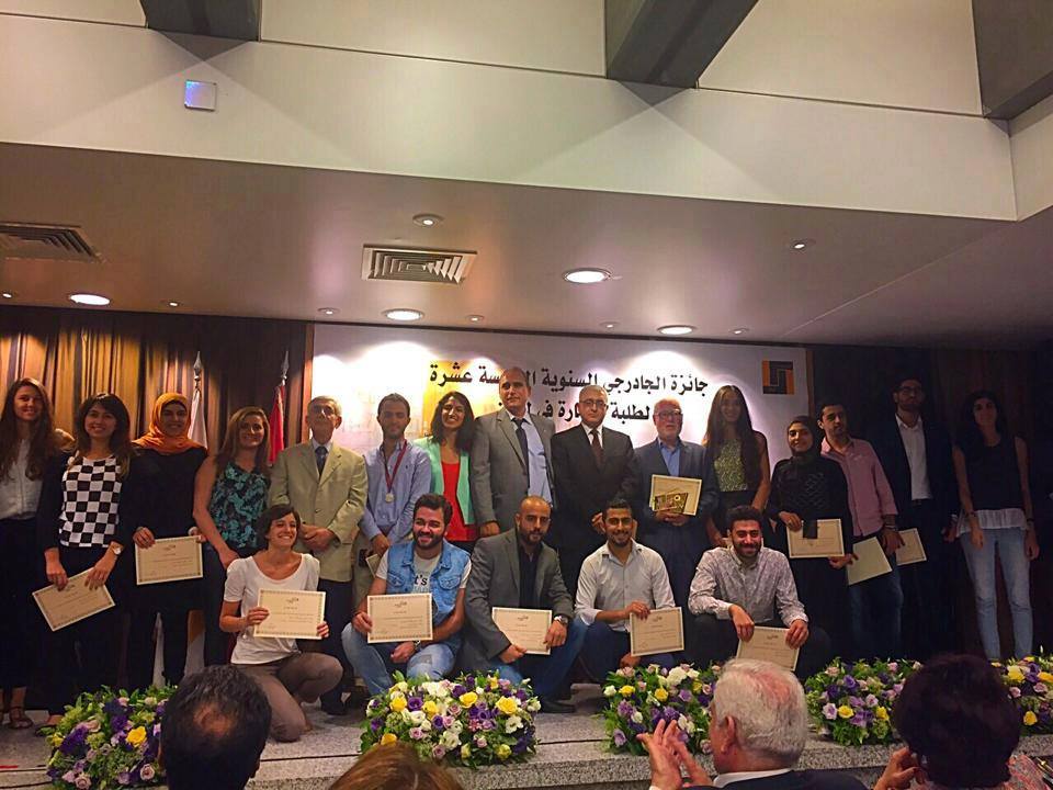
Results of the 15th Jaderji Awards 2015 for young Lebanese architects (for 2013-2014 projects):
– 1st Prize: Teddy Touma (USEK)
– 2nd Prize: Acile Sfeir (AUB)
– 3rd Prize: Mariane Ghrayche (USEK)
Congrats for the winners !!
